Revisiting SEP tour with Madagascar and SCons
Many appreciative users were introduced to SEPlib (Claerbout, 1991[1]) by an excellent article of Dellinger and Tálas (1992[2]). In this paper, I show how to create a similar experience using RSF and SCons.
Getting started
Madagascar programs can be piped and executed from the command line, for example:
bash$ sfspike n1=1000 k1=300 title="\s200 Welcome to \c2 RSF" | \
sfbandpass fhi=2 phase=1 | sfwiggle | xtpen
If you are already familiar with SEPlib, you can find most of the familiar programs with the names prepended by "sf". Typing a command without arguments, should produce a concise self-documentation.
bash$ sfbandpass
The recommended way of using RSF, however, is not with the command line but with SCons and "SConstruct" files.
Setting up
Open a file named "SConstruct" in your favorite editor, start it with a line <python> from rsfproj import * </python> and end it with a line <python> End() </python>
The first line tells Python to load the RSF project module.
Obtaining the test data
Add a Fetch command as follows: <python> Fetch('Txx.HH','septour') </python>
Now, by running
bash$ scons Txx.HH
you can instruct SCons to connect to an anonymous data server and extract (fetch) the data file "Txx.HH" from the "septour" directory.
Displaying the data
Add the following line to the SConstruct file: <python> Result('wiggle0','Txx.HH','wiggle') </python>
Note that it does not matter if this line appears before or after the
"Fetch" line. You are simply instructing SCons how to create a
result plot from the input.
Run
bash$ scons wiggle0.view
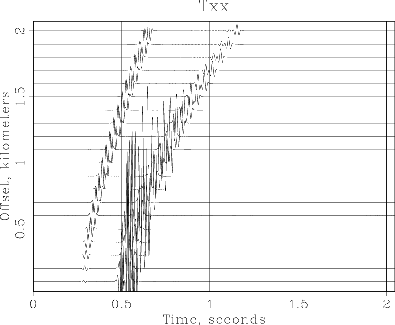
If everything is setup correctly in your environment, you should see something like the following output in your terminal:
bash$ scons wiggle0.view
scons: Reading SConscript files ...
scons: done reading SConscript files.
scons: Building targets ...
retrieve(["Txx.HH"], [])
< Txx.HH /path/to/RSF/bin/sfwiggle > Fig/wiggle0.vpl
/path/to/RSF/bin/xtpen Fig/wiggle0.vpl
and the following figure appearing on your screen.
Processing exercises
Windowing and plotting
Our next task is to window and plot a significant portion of the data. Add the following line to the SConstruct file: <python> Flow('windowed','Txx.HH','window n2=10 min1=0.4 max1=0.8') </python>
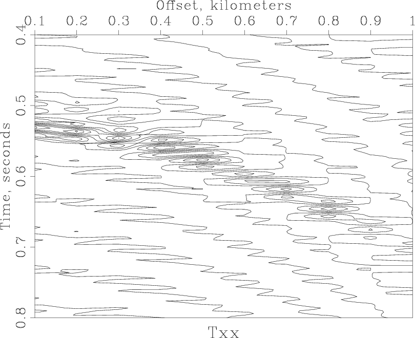
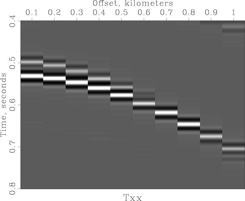
The window command selects the first ten traces and the time window between 0.4 and 0.8 seconds. We will plot the windowed data with three different plotting programs. <python> plotpar = transp=y poly=y yreverse=y pclip=100 nc=100 allpos=n
for plot in ('wiggle','contour','grey'):
Result(plot,'windowed',plot + plotpar)
</python>
For convenience, plotting parameters are put in a string called plotpar. A Python string can be enclosed in single, double, or triple quotes. Triple quotes allow the string to span multiple lines. In this case, we use triple quotes for convenience. Next, we loop (using Python's for construct) through three different programs (wiggle, contour, and grey). For each program, the command portion of Result is formed by concatenating two strings with Python's addition operator. Try running scons -Q wiggle.view. You should see something like the following output in your terminal:
bash$ scons -Q wiggle.view
< Txx.HH /path/to/RSF/bin/sfwindow n2=10 n1=200 f1=200 > windowed.rsf
< windowed.rsf /path/to/RSF/bin/sfwiggle transp=y poly=y yreverse=y
pclip=100 nc=200 > Fig/wiggle.vpl
/path/to/RSF/bin/xtpen Fig/wiggle.vpl
and a figure similar to Figure~(fig:wiggle) appearing on your screen. The -Q switch tells SCons to run in a quiet mode, suppressing verbose comments. We will use it from now on to save space. You can dismiss the figure by using the "q" key on the keyboard or by hitting the "quit" button. Run scons -Q view, and you should see simply
bash$ scons -Q view
/path/to/RSF/bin/xtpen Fig/wiggle.vpl
Since the wiggle.vpl figure is up to date, SCons does not rebuild it. After quitting the figure, SCons will resume processing with
< windowed.rsf /path/to/RSF/bin/sfcontour transp=y poly=y yreverse=y
pclip=100 nc=200 > Fig/contour.vpl
/path/to/RSF/bin/xtpen Fig/contour.vpl
and a figure appearing on your screen. Quitting the figure, produces
< windowed.rsf /path/to/RSF/bin/sfgrey transp=y poly=y yreverse=y
pclip=100 nc=200 > Fig/grey.vpl
/path/to/RSF/bin/xtpen Fig/grey.vpl
and the next figure.

Resampling
The next example demonstrated simple signal processing using the Fast Fourier Transform. We will first subsample the original data and then recover the data using Fourier interpolation. Subsampling is accomplished with sfwindow. <python>
- decimate time axis by two
Flow('subsampled','windowed','window j1=2') </python>
Running scons -Q subsampled.rsf produces
< windowed.rsf /path/to/RSF/bin/sfwindow j1=2 > subsampled.rsf
We can verify that the size of the first axis has decreased by running
sfin windowed.rsf subsampled.rsf.
Try also sfwiggle < subsampled.rsf | xtpen to quickly inspect the subsampled data on the screen. To interpolate the data back to the original sampling, the following sequence of steps can be applied:
- Fourier transform from time domain to frequency domain.
- Pad the frequency axis
- Inverse Fourier transform from frequency to time.
All three steps are conveniently combined into one using pipes. <python>
- sinc interpolation in the Fourier domain
Flow('resampled','subsampled',
'fft1 | pad n1=102 | fft1 inv=y opt=n | window max1=0.8')
</python>
Why do we pad the Fourier domain to 102? The time length of the original data is 201 samples. In the frequency domain, it can be represented with 101 positive frequencies plus the zero frequency, which amounts to 102. Note that the output of sffft1 does not contain negative frequencies. Finally, we display the result. The reconstructed data is shown in the figure. Comparing this result with the previous plots, we can verify a fairly accurate reconstruction. <python> Result('resampled','wiggle title=Resampled' + plotpar) </python>
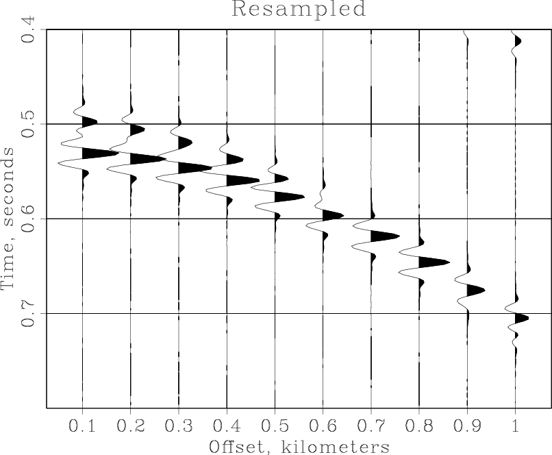
As an exercise, try subsampling the data by a factor of 4 and see if you can still reconstruct the original data with the Fourier method.
Normal Moveout
The next example applies a simple constant-velocity NMO correction to the windowed data and pipes the result to a wiggle plotting command: <python> Result('nmo','windowed',
      nmostretch v0=2.05 half=n |
      wiggle pclip=100 max1=0.6 poly=y
      )
</python>
Running scons -Q nmo.view produces
< windowed.rsf /path/to/RSF/bin/sfnmostretch v0=2.05 half=n |
/path/to/RSF/bin/sfwiggle pclip=100 max1=0.6 poly=y > Fig/nmo.vpl
/path/to/RSF/bin/xtpen Fig/nmo.vpl
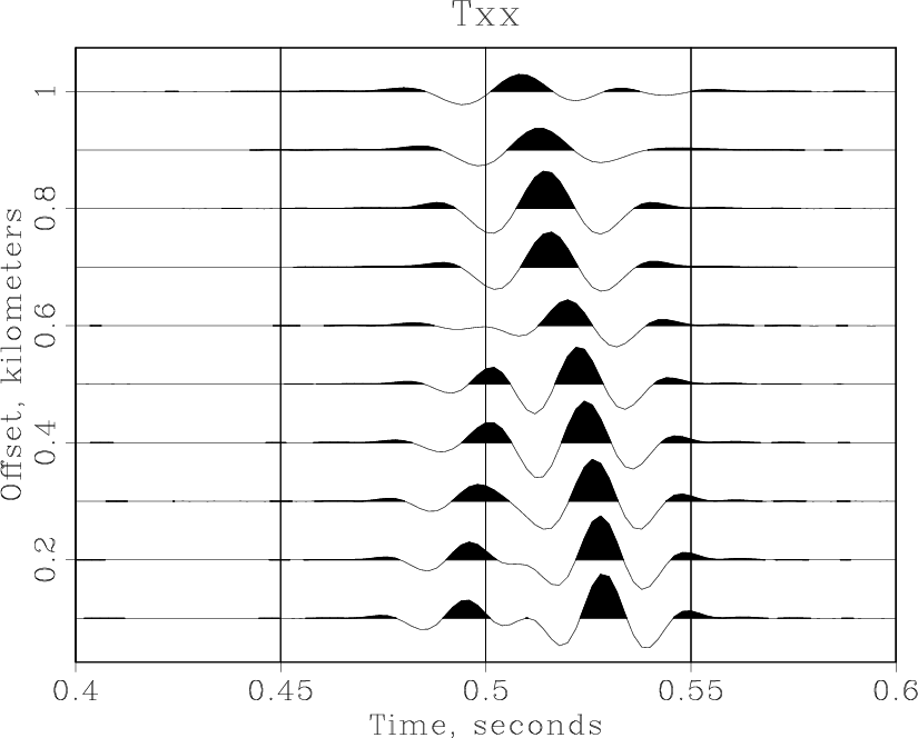
Note that SCons does not recreate the windowed.rsf file if that file is up to date. You can experiment with the NMO velocity (2.05~km/s) or with plotting parameters to get different results. As Dellinger and Tálas (1992[3]) point out, the NMO velocity of 2.05~km/s "appears to split the difference between two distinctly non-hyperbolic shear waves".
Advanced plotting
Sometimes, we need to combine different plots either by overlaying them on top of each other or by putting them side by side. Here is an example of accomplishing it with RSF and SCons. Start by creating common plotting plotting arguments and plotting the data in greyscale. <python> plotpar = plotpar+' min1=.4 max1=.8 max2=1. min2=.05 poly=n'
Plot('grey','windowed',
'grey wheretitle=t wherexlabel=b' + plotpar)
</python>
Next, plot the wiggle traces twice: the fist time, using thick black lines (plotcol=0 plotfat=10), and the second time, using thinner white lines (plotcol=7 plotfat=5). <python> Plot('wiggle1','windowed',
'wiggle plotcol=0 plotfat=10' + plotpar)
Plot('wiggle2','windowed',
'wiggle plotcol=7 plotfat=3' + plotpar)
</python>
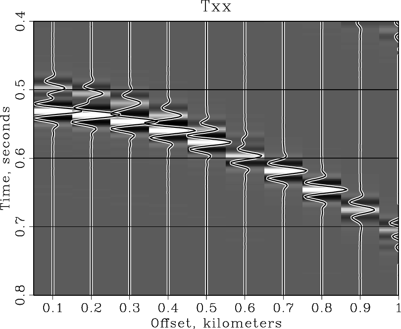
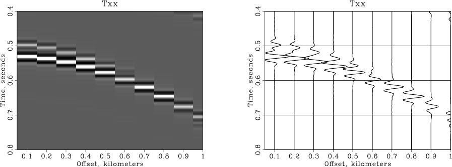
The plots are combined by overlaying or by putting them side by side. <python> Result('overplot','grey wiggle1 wiggle2','Overlay') Result('sidebyside','grey wiggle2','SideBySideIso') </python>
The resultant plots are shown in the figures.
Conclusions
This tour is not designed as a comprehensive manual. It simply gives a glimpse into working in a reproducible research environment with Madagascar and SCons. The reader is encouraged to experiment with the SConstruct file attached to this tour and included in the Appendix. For other documentation on Madagascar, please see
- Introduction to madagascar
- Installation instructions
- Self-documentation reference for RSF programs
- Guide to madagascar programs
- Guide to RSF file format
- guide to Madagascar programming interface
- Guide to programming with madagascar
Acknowledgments
Thanks to Joe Dellinger and Sándor Tálas for creating "SEP tour" and to James Rickett for updating it. Several generations of SEP students contributed to SEPlib. We try to preserve all their good ideas when refactoring SEPlib into RSF. The test dataset used in this paper is courtesy of Beltram Nolte and L. Neil Frazer.
References
- ↑ Claerbout, J. F., 1991, Introduction to Seplib and SEP utility software, in SEP-70, 413--436. Stanford Exploration Project.
- ↑ Dellinger, J. and S. Tálas, 1992, A tour of SEPlib for new users, in SEP-73, 461--502. Stanford Exploration Project.
- ↑ Dellinger, J. and S. Tálas, 1992, A tour of SEPlib for new users, in SEP-73, 461--502. Stanford Exploration Project.
SConstruct file
Here is a complete listing of the SConstruct file used in this example. <python>
- Setting up
from rsfproj import *
- Obtaining the test data
Fetch('Txx.HH','septour')
- Displaying the data
Result('wiggle0','Txx.HH','wiggle')
- Windowing and plotting
Flow('windowed','Txx.HH','window n2=10 min1=0.4 max1=0.8')
plotpar = transp=y poly=y yreverse=y pclip=100 nc=100 allpos=n
for plot in ('wiggle','contour','grey'):
Result(plot,'windowed',plot + plotpar)
- Resampling
- decimate time axis by two
Flow('subsampled','windowed','window j1=2')
- sinc interpolation in the Fourier domain
Flow('resampled','subsampled',
'fft1 | pad n1=102 | fft1 inv=y opt=n | window max1=0.8')
Result('resampled','wiggle title=Resampled' + plotpar)
- Velocity analysis and NMO
Result('nmo','windowed',
      nmostretch v0=2.05 half=n |
      wiggle pclip=100 max1=0.6 poly=y
      )
- Advanced plotting
plotpar = plotpar+' min1=.4 max1=.8 max2=1. min2=.05 poly=n'
Plot('grey','windowed',
'grey wheretitle=t wherexlabel=b' + plotpar)
Plot('wiggle1','windowed',
'wiggle plotcol=0 plotfat=10' + plotpar)
Plot('wiggle2','windowed',
'wiggle plotcol=7 plotfat=3' + plotpar)
Result('overplot','grey wiggle1 wiggle2','Overlay') Result('sidebyside','grey wiggle2','SideBySideIso')
- Wrapping up
End() </python>